I wonder if my friends have noticed why there are always two raised horizontal lines on the F and J keys of the computer keyboard we often use.
First of all, let’s review our old friend—the keyboard. From the initial typewriter to today’s mechanical keyboards and membrane keyboards, the form and function of keyboards have undergone tremendous changes.
But no matter how it changes, one classic layout has always been used, which is the QWERTY layout. This layout was created in the 1870s by an inventor named Christopher Latham Sholes[1] and is still the standard configuration for most keyboards today.
Speaking of keyboards, we cannot but mention a magical skill—touch typing. Touch typing means typing without looking at the keyboard, accurately hitting each key based solely on the feeling of the fingers. When computer office work was just beginning to rise, some professional typists needed to type at speeds of over 120 words per minute. Touch typing was crucial for them, not only greatly increasing typing speed but also reducing neck problems caused by frequent bowing to look at the keyboard.
So, how is touch typing achieved? This brings us to the protagonists of our story—the F and J keys.
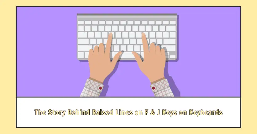
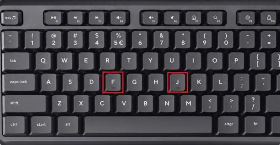
Imagine when we are typing, if we have to look down at the keyboard every time, how inefficient it would be! Moreover, doing this for a long time would put a significant burden on the eyes and neck. Therefore, designers came up with a clever solution: adding raised horizontal lines on the F and J keys. This way, when typing, we can quickly locate the position of our fingers through these two raised areas.
Specifically, the index finger of the left hand usually rests on the F key, while the index finger of the right-hand rests on the J key. The raised areas on these two keys act like a compass. When touch typing, without looking at the keyboard, we can locate the position of our fingers. Once accustomed to this touch typing method, we can easily type fluent text without looking at the keyboard.
This seemingly insignificant design embodies the wisdom and thoughtfulness of designers. I hope everyone can feel the care and warmth of the designers while enjoying efficient typing!
- [1] Christopher Latham Sholes: https://en.wikipedia.org/wiki/Christopher_Latham_Sholes
- Source: Internet

Disclaimer: This article is created by the original author. The content of the article represents their personal opinions. Our reposting is for sharing and discussion purposes only and does not imply our endorsement or agreement. If you have any objections, please contact us through the provided channels.